The “flat” 3-D look: A brief history of cel shading in video games
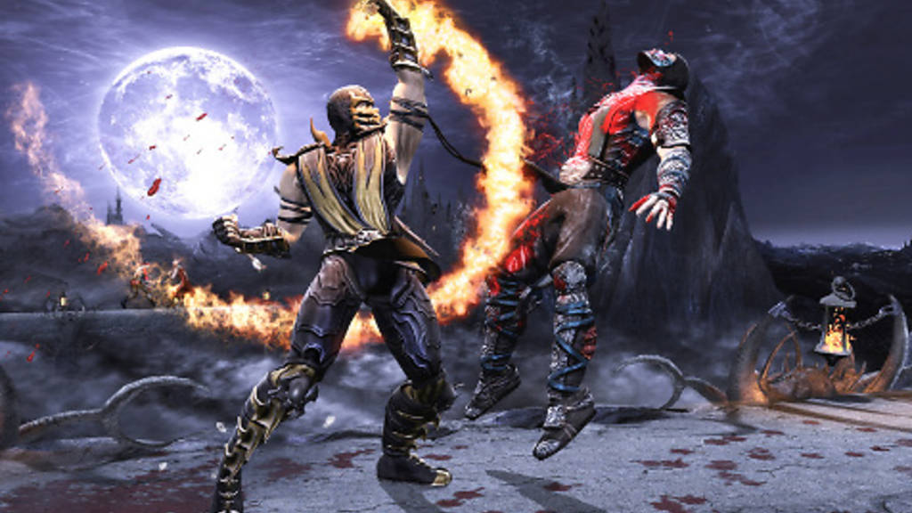
Borderlands: The Pre-Sequel!
Borderlands: The Pre-Sequel! (2014)
Every time a new Borderlands game comes out, I’m reminded of how much I love cel shading—the distinct look that emerges when a 3-D model is rendered to appear as a work of illustration through outline, cartoon shading, or flattening. You see it more frequently of late, as the style now shows up even in games where cel shading isn’t the chief aesthetic. There it is in the animated opening video of Blizzard’s Diablo III (2012) and again when you look closely at the characters in Ubisoft’s Child Of Light (2014). The recent release of Borderlands: The Pre-Sequel!—the Borderlands series has employed the style since the start—is a great excuse to dive into the history and types of cel shading that have emerged throughout the years.
Pac-Man (1980)

Pac-Man isn’t on Wikipedia’s list of the hundreds of games that have used cel shading, but it’s still an important early example of the tight link between games and the world of illustration and animation. Not only did Namco’s Pac-Man look like a cartoon on-screen, but it had all the trappings of cartoon branding on its arcade cabinet (pictured above). An early, bold media crossover was Advanced Microcomputer Systems’ Dragon’s Lair (1983), which featured animation by ex-Disney artist Don Bluth and further deepened the ties between gaming and cartooning. Although cel shading takes its name from hand-drawn animation cels, 2-D animated games like Dragon’s Lair are not considered cel-shaded. The term refers specifically to the stylized visual treatment of 3-D models that consoles and computers could only handle in more recent years.
Before cel shading, the 16-bit Super Nintendo and Sega Genesis consoles could play games that really began to look like their print, television, and film cartoon counterparts, and leading animation companies farmed out their characters to the game industry from the ’80s on. Apart from the dominance of Mario and Sonic, memorable games from this era of cartoon stars include Konami’s The Simpsons Arcade Game (1991), Sega’s Castle Of Illusion Starring Mickey Mouse (1990), and Shiny Entertainment’s Earthworm Jim (1994), an original video game cartoon creation. They and their peers set precedents for the visual style that would become cel shading.
Jet Set Radio (2000)

Then Smilebit produced Jet Set Radio (initially released as Jet Grind Radio in North America). Jet Set art director Ryuta Ueda developed a look to channel the energy of a world defined by skaters, graffiti artists, J-pop, and hip-hop. Ueda brought his concepts to Masayoshi Kikuchi, the game’s director, who got on board. Jet Set Radio features a black outline around the player’s character, which does double duty: It distinguishes your avatar from pedestrians while accentuating the world’s verve. Game developers went crazy for this new style, especially as a way to create a game with graphics that would stand the test of time as graphics hardware evolved. The early 2000s were a time of rough polygons, and game studios made efforts to approach photorealism in fits and starts, but smart art directors built living, cel-shaded 3-D worlds that wouldn’t look dated in two years and sidestepped this awkward transitional period.
The Legend Of Zelda: The Wind Waker (2003)

Nintendo’s The Legend Of Zelda: The Wind Waker is probably the most famous cel-shaded game, although its graphics weren’t universally beloved by Zelda fans at the time. Before Wind Waker hit, the last big Zeldagame was The Legend Of Zelda: Majora’s Mask (2000), which copied the more traditional polygonal graphics from Ocarina Of Time (1998). So when Wind Waker shipped with an overtly childish manga cartoon style, fan reaction was split. The thick outline was dropped and the game’s 3-D models were flattened out in blocks of color with shading for a more abstract look. Gone were the pre-shaded 3-D models of earlier games—notice how when Link opens a chest in Ocarina Of Time and the blinding light pours out, the shadows on his face and tunic don’t disappear—in favor of a dynamic lighting system that responds as Link scampers from light to shadow.
Okami (2006, left) and “Morning View Of The Uji River” (1824 ink-wash painting, right)

Clover Studio’s Ōkami used an art style that brings a Japanese scroll ink-wash painting to life. Note the echoes between Ōkami and Aoki Mokubei’s “Morning View Of The Uji River.” The world of Ōkami and its main character, the Shinto sun goddess Amaterasu in the form of a white wolf, are drawn in a thick black ink outline with the grain of the paper visible. It’s a brilliant approach to game making: Draw upon the mythology of a place in time, and tell the story in the language of that time period. Though this could hardly be considered an educational game—it was only loosely inspired by Japanese mythology and art history—by recreating both the form and content of Shinto iconography, Ōkami not only looked different, but it also felt different from any other game of its time. Clover’s development team even took the concept one step further, incorporating the thick black brush that “drew” the world and characters into play: You use the brush to interact with the environment and cast magic in battle.
The Wolf Among Us (2013-14)

Cel shading has also been used as a way to connect with illustration traditions in comics. Telltale Games’ The Walking Dead (2012) and The Wolf Among Us are adaptations of Image’s The Walking Dead and Vertigo’s Fablesseries, respectively. In Telltale’s hands, the games become a way to bridge media while sharing a related visual aesthetic rooted in the original form. Telltale’s games resemble graphic novels, albeit with a style distinct from Walking Dead and Fables. It’s a look that comics readers will be familiar with, which is a smart touch by the studio. In any adapted work, it can be helpful to bridge the gap between media by referencing the source material not just in the content but also the style—an approach that, in this instance, helps ground the games for fans of the original comics.
Mad World (2009, left) and Sin City (1991 comic series, right)

Another comic-inspired cel shader is PlatinumGames’ MadWorld. Platinum was founded by some Clover alumni, and they brought their cel-shading prowess with them. This game looks like you’re playing a noir comic book, and its link to Frank Miller’s 1991 Sin City comics is indisputable. All gray scale is eliminated, and the hyper-violent game is visualized in stark black and white. Comic artists who employ this technique distinguish between shapes, characters, and environment on the page with careful use of the contrasting shades. For example, a black character against a black sky is wreathed in a white outline, and the lines describing the face are in white. MadWorld was a good fit for the Wii console because, as mentioned above, cel-shaded games are often easier for computers to render than those pushing the boundaries of realism. With the Wii competing against the more powerful PlayStation 3 and Xbox 360, MadWorld was an attempt to show that Nintendo’s console could generate spectacular visuals of its own.
Afro Samurai (2009)

Cel shading is in its infancy. The realms of line-based illustration and abstract figuration are limitless, and game developers have a wealth of material from art history to draw from. As such, cel-shaded games wildly vary in aesthetic. One of the more creative is Namco Bandai’s Afro Samurai(2009). It’s based on the work of illustrator Takashi Okazaki, who mashed up Japanese manga and futuristic samurai with hip-hop culture. They say you should never judge a book by its cover, but the game’s art was so unlike anything else out there that it’s one of the few games I’ve ever bought based on box art and screenshots alone. Combined with its soundtrack with input from RZA, it’s a perfect addition to the trend of media that fuse martial arts and African American culture—a trend that began with Bruce Lee’s popularity among black audiences in the 1970s and continued with crossover films like The Man With The Iron Fists.
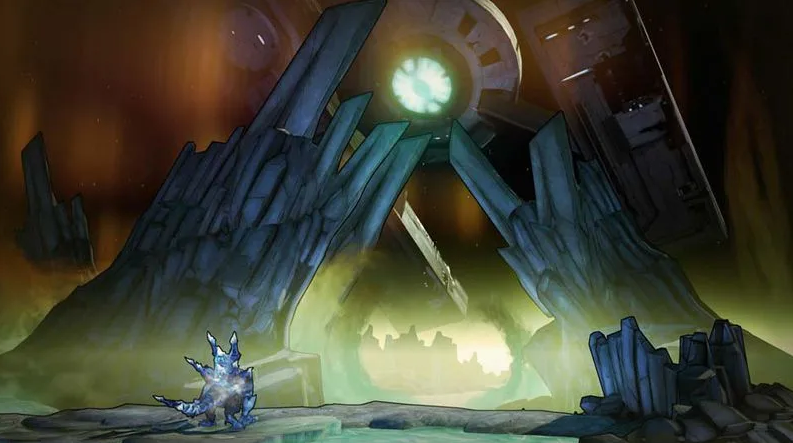
Borderlands (2009, left) and Codehunters (2007 short film, right)

With both cel-shaded environments and characters, Gearbox’s Borderlandsseries distinguished itself aesthetically from other first-person shooters in its class. Initial art direction for the first Borderlands was scrapped in favor of this style—compare the footage from a 2008 preview at the E3 trade show with the finished product as seen in a 2009 trailer. The series’ look has been compared to Ben Hibon’s short film Codehunters, and the debts to this stunning work are obvious. With a dusty muted palette and uber-slick animation, Codehunters provided the artistic inspiration that Borderlands needed to stand out in a saturated field of post-apocalyptic games, films, and graphic novels in the late 2000s. The first game stayed somewhat close to the short film’s vision, but since Borderlands 2 (2012), the series has adopted a more colorful palette under Jeramy Cooke’s art direction. Borderlands: The Pre-Sequel! (2014) is set on Pandora’s moon, and while the need to manage your oxygen meter makes it more difficult to relax and explore, its pop colors and outlined landscapes are gorgeous views worthy of appreciation when you do get some rare downtime.
This article was published on AVClub here.